DBS digibank Redesign
- Client
- Personal project
- Industry
- FinTech / Product Design
- Services
- Product Design, Interaction Design, Motion, Data Modeling
- Released
- November 2026
- Location
- Singapore
01
Project Overview
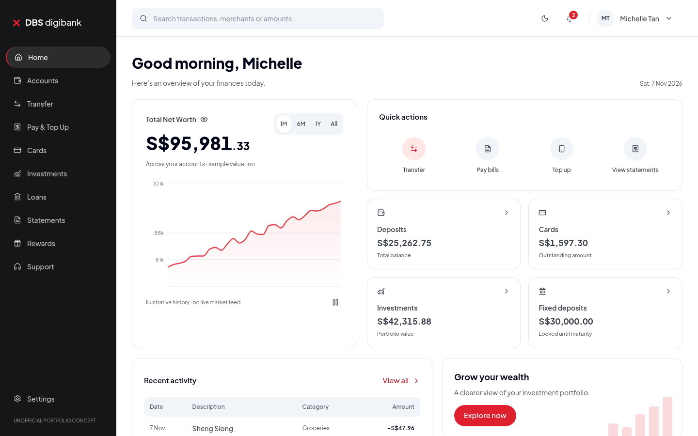
A personal redesign of the DBS digibank experience, rebuilt as a fully working prototype. The goal was to turn a static redesign into a living product a reviewer can actually use — with a coherent financial model behind every number on screen.
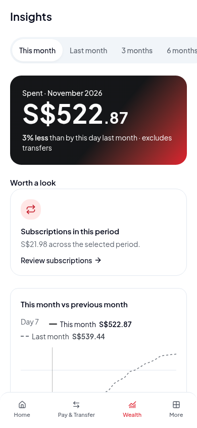
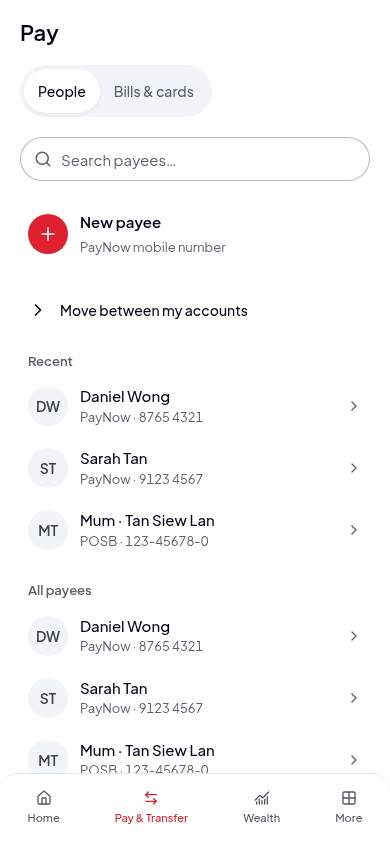
The redesign keeps the visual identity I loved — red, charcoal and light grey with a strong money hierarchy — while rebuilding the information architecture around one consistent sample ledger, so net worth, transactions, spending insights and transfers all stay in sync across mobile and desktop.
02
Intro Film
03
Interface Motion
Motion study of the final interface — how screens transition, how data animates and how the product feels in the hand.
04
Objectives
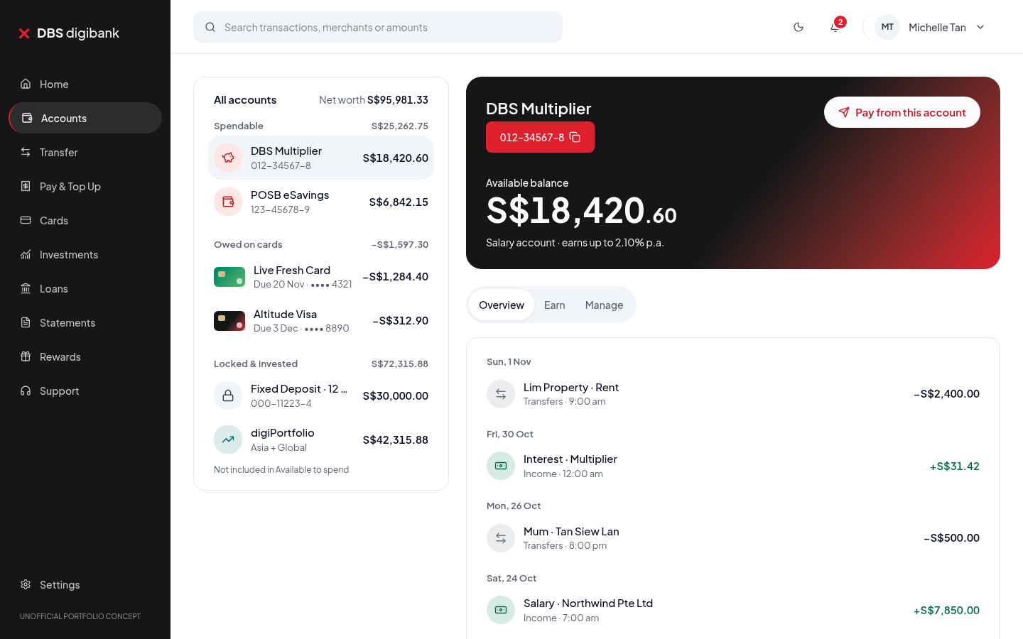
- One source of truth: every balance, transaction and spending chart derives from a single financial model — an internal transfer never changes net worth, and a card payment reduces cash and debt together.
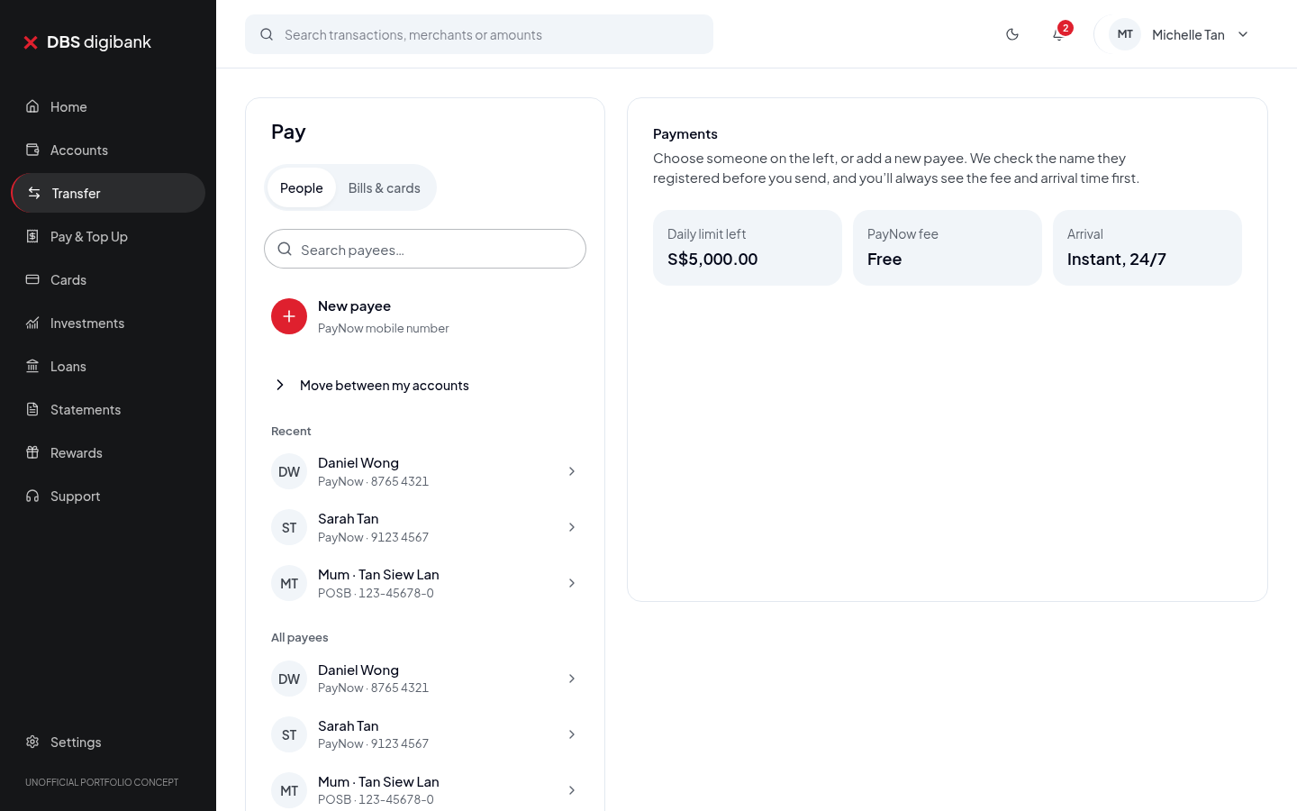
- Honest functionality: clearly separate working prototype behavior from simulation, and never present unprocessed actions as completed.
- Consistent privacy: balance-hiding masks amounts everywhere — screens, transaction detail, chart descriptions and assistive text.
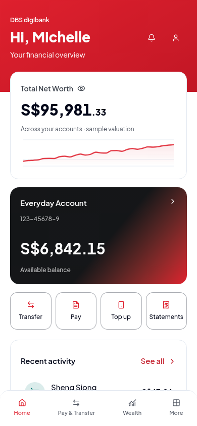
- Real responsiveness: phone, tablet and desktop each get a purpose-built layout instead of a fixed phone frame.
- Accessible endings: named icons, visible focus, focus trapping and return in dialogs, generous touch targets and reduced-motion support.
05
Design Concept
Calm money, clear hierarchy.
- Spendable money and net worth are visually separated so users never confuse the two.
- Charts animate on data change only — motion expresses the data, never invents it.
- Elastic expanders, graph transitions and selection feedback carry the personality; loading, empty, error and success states are designed, not default.
- Card art is drawn in code, keeping the green and charcoal card expressions crisp at any size.
06
Final Design — Desktop
07
Final Design — Mobile
Swipe to explore →
08
Tools Used
- React / TypeScript / Tailwind / Motion
- Figma
09
Conclusion
A working prototype that reviewers can click through end to end — from demo transfers to insights — proving the redesign as a product, not a picture.
Next project
Waymark — Application Board →